Autocross Pictures
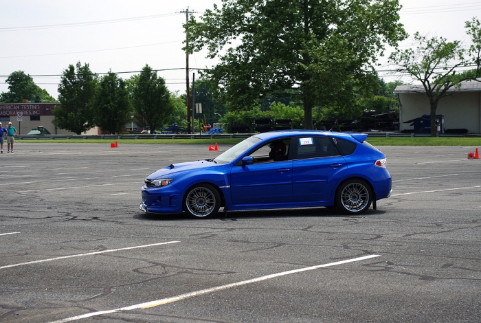
As mentioned in my last post, last weekend I went to an autocross and took some pictures with my new 135mm prime lens. It’s an old completely manual lens that I picked up on craigslist. I just, finally, finished looking through the pictures and editing them and thought there were enough good ones to merit another post. (one thing I have to work on is shooting LESS, but good quality, pictures. I take way too many, with too few keepers.)
Being completely manual, the lens certainly is challenging to use at an event like this. You can’t follow a car through the course shooting at will, but instead have to pick your spots and focus and meter accordingly. I found it was easiest to choose key places where I wanted to shoot, focused for those spots, set the camera accordingly, and then just had to be sure to take the picture at the right time. I didn’t have as many keepers as I would have liked, but it seemed to work pretty well as I got used to it. Overall I’m very satisfied with the lens; none of the pictures below are razor sharp or crystal clear (even after post processing), but the colors, sharpness, and image quality overall were overwhelmingly acceptable, if not good. In some cases, I think it does better than the kit lens (more on that below). And all for just $10!
I HAVE A REQUEST: If any reader(s) would be so kind, I’d appreciate knowing if any of my colors look weird/off/wrong/funky to you, especially GREENS! Truth be told, I’m a little color blind and struggle with greens. I thought I was doing okay, but had a print made (portrait of a family member) this weekend where the colors of grass and trees in the background looked really weird. So, if you could, please point out any photos where colors are noticeable off to you. I won’t take any offense – you’ll be helping me. THANKS!

Check out Snoopie on the front corner!
I took a few pictures with the kit 18-55 lens, too. Below are some examples. They turned out okay and are usable, but I’m not as impressed with it as I have been in other shooting situations. The 135mm lens actually seemed better here. There colors were better (in my opinion) and there was less noise when using the prime. Hmm.


These look super good! Loving that new lens of yours. I think the green and your white balance look great in the first set of photos! The only thing I notice is the second-to-last photo looks a bit red/blue to me, more so than the one following…. look at the asphalt especially for side-by-side comparison. It doesn’t look bad however, by any means. I’m not sure I knew you had slight color-blindness.
dinnersforwinners
June 17, 2013 at 5:18 pm
Thank you for the feedback, Sophie… I really appreciate it. When you point it out I can see a difference, but wouldn’t pick up on it on my own. I honestly don’t see red/blue (or maybe don’t understand), but the second to last looks too dark now, and the building in the back ground is bluer.
And yeah, I’m quasi-colorblind. I guess technically I am truly colorblind, but I do pretty good with most colors. Have most trouble with certain shades of greens and blues, can’t tell them apart, and beige’s, grays, “off-whites”, and the like are very hard to tell apart. Many funny/embarrassing stories about wearing mismatching clothes (unknowingly buying and wearing a pink shirt to high school, for example) to bigger things, like when I worked as a car sales man and tried to convince some customers that two cars were the same color that actually weren’t. After that, I always read window stickers to be sure I knew what color the cars were. :)
Jim
June 18, 2013 at 8:05 pm